Discover how the 2025 marketing funnel transforms awareness into conversion using social media, smart booking tools, and UX-driven websites that turn visitors into buyers.

October 30, 2025
Read Time
7 min

Introduction
If marketing was once about attention, it’s now about direction and guiding people smoothly from “never heard of you” to “I trust you enough to buy.” That journey is the marketing funnel, and while the structure remains, the tools and touchpoints have changed dramatically.
In 2025, customers don’t just follow your funnel they jump in and out of it across multiple platforms. TikTok shops, Instagram Checkout, and smart tools like Heyflow or Perspective have shortened the path between interest and conversion. But understanding the funnel still matters, because it’s how you identify where trust begins, and where it breaks.
Let’s break it down.
1. Awareness: Being Seen Where It Matters
This is the widest part of the funnel - the “hello” moment. Your goal here is to make people notice and remember. Awareness in 2025 happens across many platforms:
Social Media (TikTok, Instagram, LinkedIn) through storytelling, short-form video, and creator partnerships.
SEO & Thought Leadership (educational content that answers real questions and ranks for intent-driven keywords.)
Paid Prospecting (Meta Ads, YouTube Shorts, and Google Discovery campaigns are the digital billboards of today.)
📊 Stat check: According to HubSpot’s 2025 State of Marketing Report, 96% of marketers report increased sales from personalized experiences” according to HubSpot
If you’ve read our piece on short-form content, this stage is where scroll-stopping storytelling wins.
1.1 From Attention to Recognition
Getting seen is easy. Getting remembered is strategy.
In a feed full of identical hooks and ad formats, users remember feeling something more than seeing something. That means tone, visual rhythm, and timing matter as much as the message itself.
Use storytelling formats that reflect your brand’s purpose not just trends. A 6-second TikTok can introduce your personality better than a 60-second explainer if it delivers emotion and intent clearly.
💡 Pro tip: Aim for recognition, not just reach. A smaller, engaged audience that remembers you beats millions of passive impressions every time.
1.2 Storytelling That Educates, Not Just Sells
Top-funnel content in 2025 isn’t about pushing features. It’s about teaching something valuable fast.
Educational content builds credibility and credibility builds trust. Whether it’s a quick “how-to” video, a behind-the-scenes look, or a mini case study, the goal is to make the viewer smarter for engaging with you.
1.3 Personalization at Scale
The biggest shift in 2025 awareness marketing? People expect personal relevance even before they know your brand.
AI-driven ad tools and creative automation make it possible to tailor copy, visuals, and tone to specific audiences. But personalization isn’t just about data but context.
Think of how your message lands in each environment: a TikTok viewer isn’t in the same mindset as a LinkedIn reader. Framing the same message with platform-native tone is the new baseline.
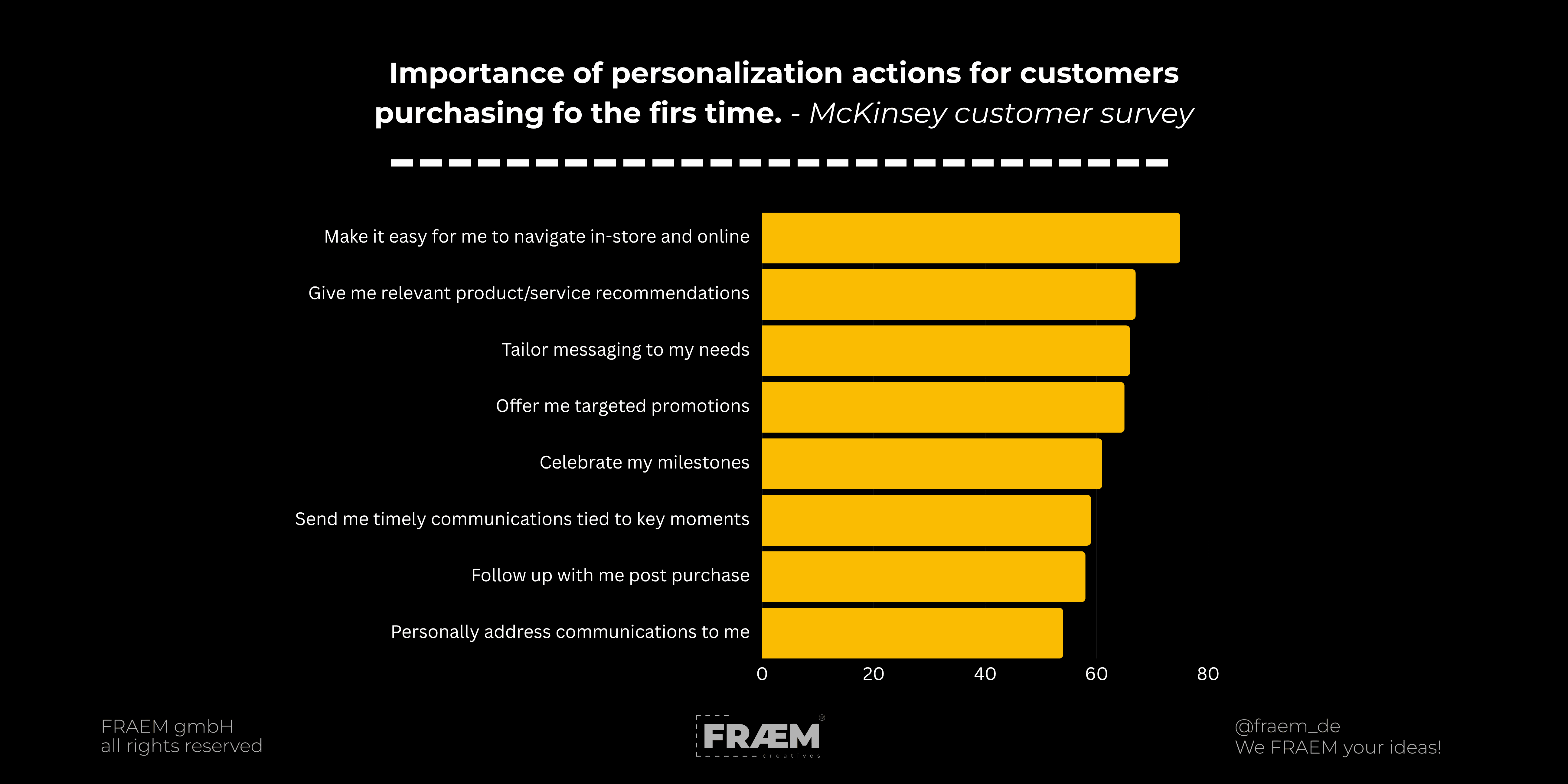
📈 Data note: 72% of consumers say they only engage with personalized marketing messages (McKinsey).
1.4 The Visual Hook: Why Design Still Matters
Even at the top of the funnel, visuals set the tone for your brand’s trustworthiness.
High-quality motion, cohesive type, and contrast-driven hierarchy make users stop scrolling — not because it’s flashy, but because it looks intentional.
Your design language should carry clarity, not clutter. Remember our take from “Good Website Design Isn’t Creative. It’s Clear.”: design guides, it doesn’t distract.
A well-crafted video thumbnail or a clean landing page can do more for awareness than an entire campaign if it communicates value instantly.
2. Interest: Holding Attention and Building Trust
Once people know you exist, the challenge is keeping them engaged. This is where trust starts forming.
Use content that educates rather than sells:
Explainer videos
Customer stories or case studies
Guides and how-tos
The goal? Help them see why you exist and why it matters to them.
🎥 This is where video content shines as explored in our upcoming article “Conversions Through Trust: When Websites Meet Video.” Video adds human context to your brand, and that’s what turns curiosity into belief.
2.1 Knowledge = Credibility
When users start researching, they’re looking for competence.If your content explains their problem better than anyone else, you’ve already started earning their trust.
Think of this phase as a series of “micro yeses”:
They read your blog because it’s clear.
They watch your video because it feels honest.
They follow your page because it’s valuable.
Each small win pushes them closer to believing you’re the expert.
2.2 Video: The Shortcut to Human Connection
Video is where trust either deepens or disappears. In a digital world filled with static posts and polished ads, moving images and real voices still cut through faster than anything else. People don’t connect to taglines they connect to people. Facial expressions, tone of voice, pacing, and authenticity trigger emotional responses that static visuals simply can’t replicate.
Video’s strength lies in how it communicates emotion and intent. A two-minute testimonial filmed in natural light can outperform a scripted, high-budget production because it feels real. The same goes for behind-the-scenes clips or honest explainers where brands speak like people, not billboards. These moments humanize your message and turn “viewers” into participants who feel like they’ve met your team, not your marketing department.
At FRAEM, we call this approach face-first communication - putting real people, real voices, and real experiences at the center of storytelling. In an era where trust determines attention, showing up on video isn’t optional it’s the new baseline for credibility.
2.3 Consistency Builds Familiarity
Visibility means nothing without familiarity. People remember what they see repeatedly, and more importantly, they remember how it made them feel. A consistent brand presence across platforms creates a sense of reliability the kind of quiet, accumulated trust that turns casual scrollers into repeat customers.
Consistency doesn’t mean repeating the same post everywhere or following every trend. It means your brand has a recognizable rhythm, tone, and visual language that feels steady no matter where someone encounters it. The goal isn’t uniformity but alignment - the same story told through different mediums, from a Framer-built landing page to a TikTok edit or a thought-leadership post on LinkedIn.
When your design system, copy, and motion language all reinforce the same idea, users subconsciously translate that as stability. And stability is the foundation of trust.
2.4 Give Before You Ask
People can tell when you’re only showing up to sell. Real interest starts when you offer something useful with no strings attached. It could be a simple tutorial, a behind-the-scenes look, or a free resource that actually helps.
When you give before you ask, you build credibility without saying a word. It’s not about how much content you push out, but how valuable it feels. The more your audience learns from you, the more they’ll trust you when it’s time to buy.
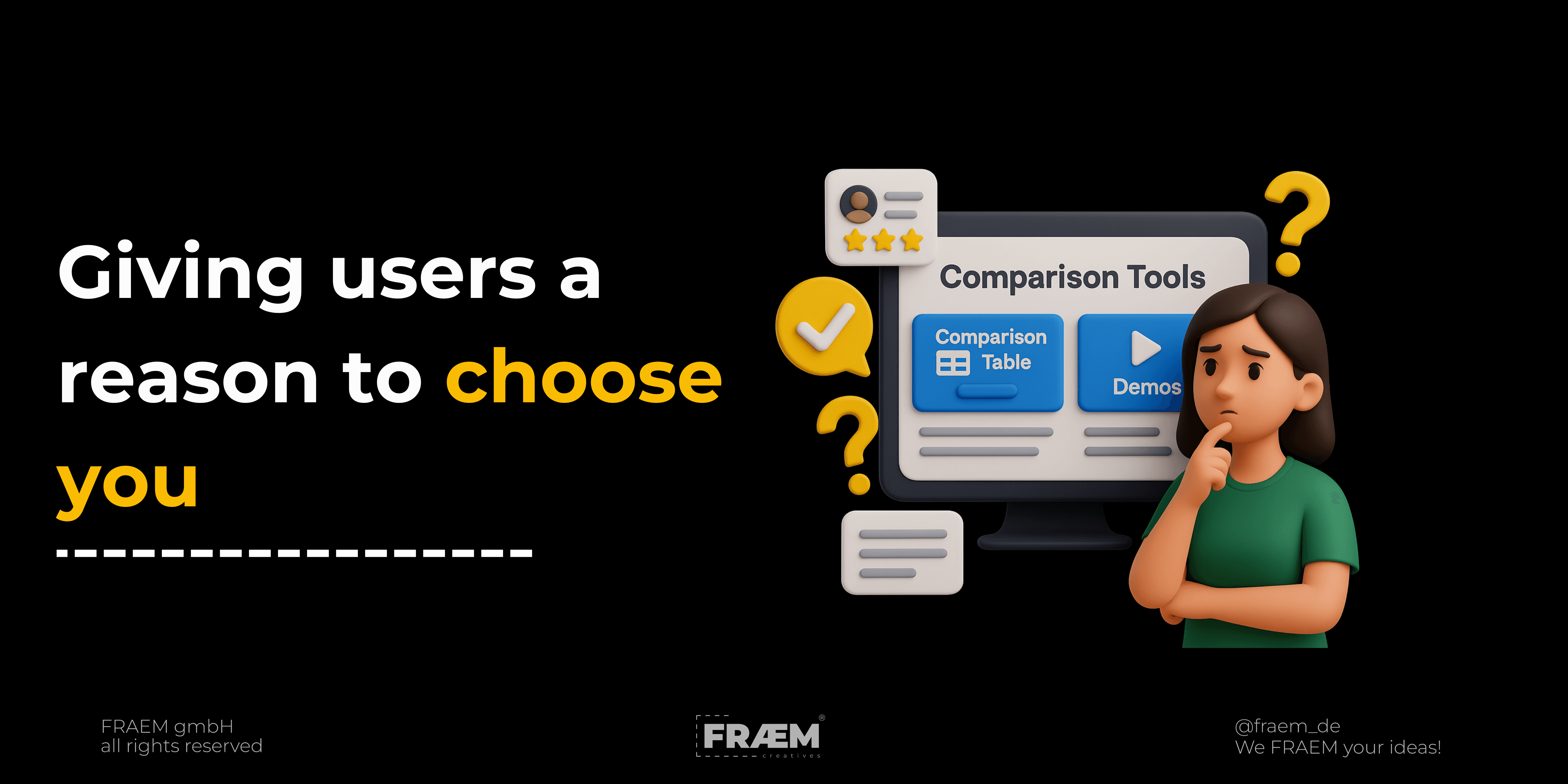
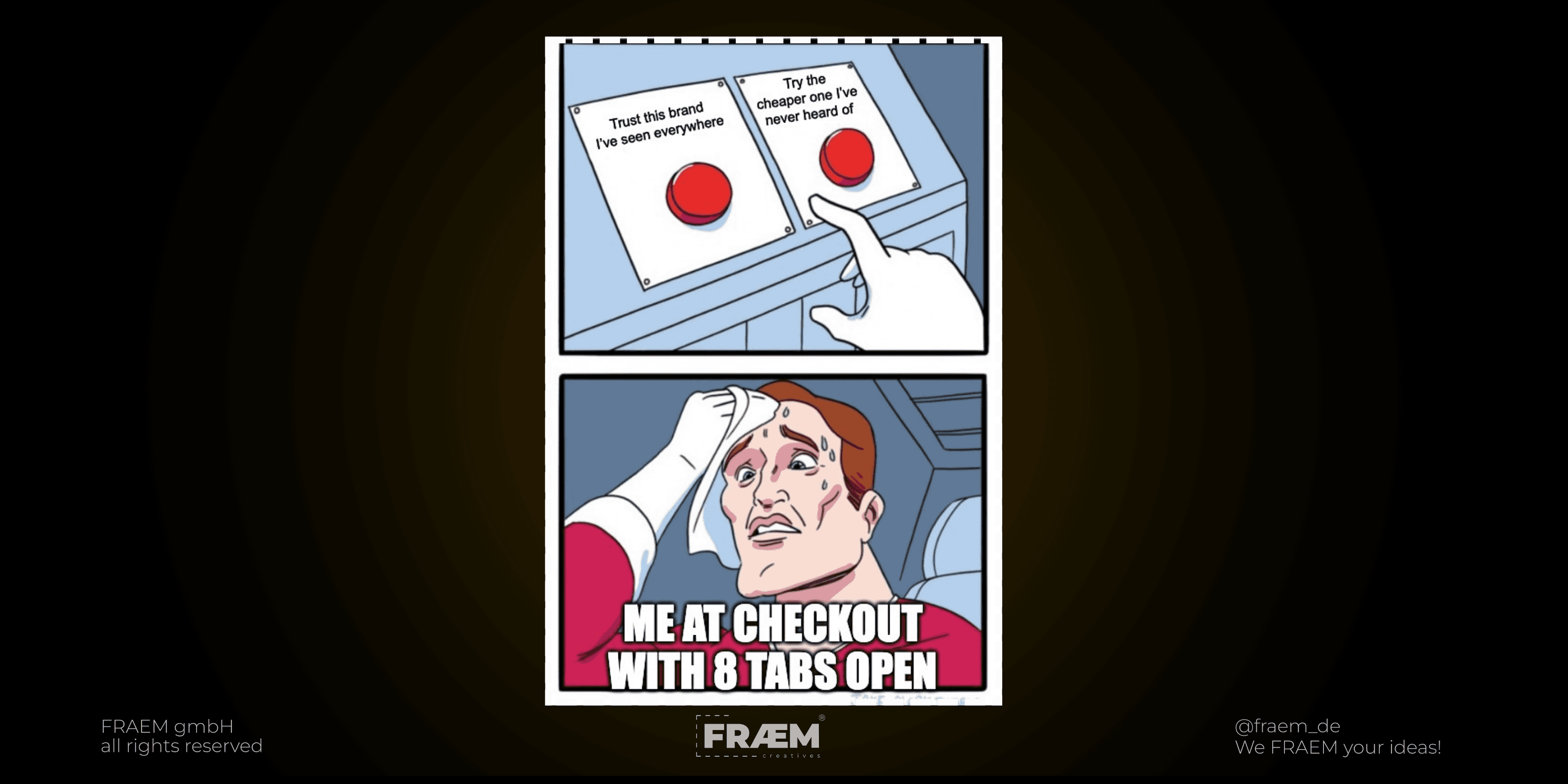
3. Consideration: Giving Users a Reason to Choose You
At this point users are actively comparing options, asking “Why you instead of someone else?” This isn’t about flashy visuals or clever slogans it’s about clarity, assurance and relevance.
This is where UX, messaging, and proof matter.
Clear, consistent web design (read: Clarity Over Creativity in Web Design)
Testimonials and social proof
Interactive tools (quizzes, calculators, demos)
3.1 Clarity reduces friction
Most users won’t spend time figuring you out. They land, they scan, and they decide usually within seconds. That moment determines whether they scroll or leave. Clear design, structure, and messaging do the heavy lifting here. If your page instantly answers what it is, who it’s for, and what to do next, you’ve already built trust. When the structure and messaging are fuzzy, users feel uncertain and leave. The clearer your language and flow, the higher the trust (and trust drives conversions).
3.2 Trust signals matter more than polish
When considering brands, people look for cues that say “these people know what they’re doing”. A site can look beautiful and still feel off. What really earns confidence are the subtle cues of credibility: consistent visuals, simple navigation, honest testimonials, recognizable logos, or even small details like transparent pricing. These moments tell people you’re real and reliable. Perfection isn’t the goal. Feeling trustworthy is.
3.3 Informing beats selling
Not every visitor wants to buy right away. Some are still exploring, learning, comparing. The best thing you can do here is teach instead of push. When you help people understand a topic or solve a problem, you position your brand as a partner, not just a seller. Clear, useful content earns attention, and that attention builds trust long before they click “Buy.”
3.4 Comparison tools need clear pathways
When people start comparing you to others, that’s your chance to make their decision easier. Use straightforward comparison tables, honest product details, and visible calls to action. Don’t make them search for what matters. The more transparent you are, the more control they feel, and control builds confidence. A confident visitor is only one click away from becoming a customer.
4. Decision: Turning Interest Into Confidence
Reaching the decision stage means your audience has moved past curiosity. They already know who you are, and they’re comparing you against others. At this point, the question isn’t “Do I like this brand?” but “Can I trust this experience enough to move forward?”
The decision phase is where marketing ends and experience begins. You can have the best campaign in the world, but if your user journey feels clunky, inconsistent, or uncertain, you lose the sale. According to the Baymard Institute’s 2025 Cart Abandonment Report, 70.22% of users abandon online purchases, with over half citing usability frustrations or unexpected costs as their reason for leaving (Baymard Institute).
That’s not just an e-commerce problem it’s a trust problem. When people are ready to act, even the smallest friction signals uncertainty.
4.1 Clarity Lowers Decision Fatigue
Cognitive science shows that when users are overwhelmed with information, they delay or abandon decisions. The Nielsen Norman Group explains this through the concept of cognitive load - every unnecessary visual, form field, or navigation choice drains focus and reduces action likelihood (Nielsen Norman Group).
In simpler terms: the harder it feels, the less likely they’ll do it.
This is why decision design is not about persuasion, but ease. Users don’t want to decode clever UX; they want to feel smart and in control. A streamlined checkout, a short contact form, or a frictionless Framer interaction signals competence and it builds trust.
When your flow just works, users subconsciously associate that ease with reliability.
4.2 Trust Signals Speak Louder Than Promises
People don’t believe brands because they say they’re great. They believe them because other people do. Real proof always beats clever copy. Show what you’ve done, who you’ve worked with, and what real customers are saying about you.
Whether it’s a testimonial, a familiar logo, or clear pricing, these small signals add up to confidence. They remove doubt right at the moment when someone is deciding if they should click “buy” or “book.”
Think about it this way: your visitors are already looking for reassurance. You just need to make it easy for them to find it.
4.3 Experience Is the Ultimate Differentiator
At the bottom of the funnel, design alone isn’t what wins. The real difference comes from how your brand feels to use. Good UX doesn’t get in the way, it guides people smoothly from curiosity to confidence.
Every small detail matters: how fast the page loads, how natural the flow feels, how the visuals match the message. When everything works together, users don’t just visit your site but experience your brand.
That sense of ease and consistency builds trust without saying a word. Because when something just works, people remember it. And when they remember it, they come back.
5. Action: Removing Barriers, Not Adding Features
The final stage of the funnel used to be straightforward: click “buy,” fill out a form, done. But in 2025, action is everywhere.
Conversions no longer live only on your website. TikTok, Instagram, and even tools like Heyflow or Perspective now host complete, high-performing micro-funnels that don’t require a browser tab at all.
This shift has made the bottom of the funnel more distributed than ever but also more fragile.
Every platform has its own UX language, attention span, and trust dynamic. What ties them all together is consistency. Users should feel the same ease and credibility whether they’re on your landing page or checking out via Instagram Shop.
5.1 The New UX Rule: Predictability Builds Trust
Good UX is not about surprise. It is about comfort. When someone lands on your site, they already have expectations of how things should work. The easier it feels to navigate, the more confident they become. Clear structure, visible buttons, and natural flow are what make users feel safe to act.
Predictability does not make your site boring. It makes it reliable. People trust what feels familiar. That is why we design Framer websites that feel intuitive and grounded, even when they look bold. Every click and scroll should quietly reassure the user that they are exactly where they need to be.
5.2 Conversion Beyond the Website
A key misconception is that conversions only “count” when they happen on your own site. That thinking is outdated. The modern funnel is platform-agnostic. Whether it’s an in-app purchase, a booking via a Typeform flow, or a direct checkout on TikTok, the psychology is identical: users act when the barrier feels invisible.
Our role as designers is to keep that barrier low everywhere. Framer, in particular, allows us to build landing pages that connect seamlessly to external funnel tools while maintaining consistent design and messaging. It’s the invisible bridge between intent and action.
5.3 Iterate for Real Insight
The funnel does not stop when someone converts. That is where the real insight begins. Every click, scroll, and hesitation reveals something about your users. It shows what worked, what caused doubt, and what could be simpler next time. These small clues are gold for optimization.
Smart brands treat their funnels as living systems, not finished projects. They test, learn, and improve. Tiny changes often lead to major results.
At FRAEM, we see clarity as a continuous process. You do not just design it once and move on. You listen, refine, and rebuild around real behavior. That is how clarity becomes growth, and growth turns into long-term trust.
6. Retention: The Funnel That Never Ends
Once someone converts, the real work begins. Retention is where brands either fade into the noise or turn customers into advocates. Because when someone trusts you enough to buy once, the easiest win isn’t finding the next lead it’s keeping the one you already earned.
Retention isn’t just about loyalty programs or discount codes. It’s about building an ongoing relationship that delivers continued value. The most successful brands treat the post-purchase phase as an extension of their content and UX strategy, not an afterthought.
Retention fuels awareness, loyalty fuels referrals, and referrals restart the entire journey organically.
6.1 Turn Transactions Into Relationships
Once someone buys from you, the real story starts. People don’t want another sales pitch. They want to feel like they made the right choice. A simple thank-you email, a quick how-to video, or a genuine follow-up that helps them get more out of what they just bought goes a long way. It shows that you care about their experience, not just their purchase.
Personalization is the difference between a transaction and a relationship. The brands that keep showing up in thoughtful, human ways are the ones people remember.
If your website speaks with warmth and clarity, your follow-ups should sound the same. Keep the tone real, keep it helpful, and keep it you. That consistency reminds your customers why they trusted you in the first place.
6.2 Use the Tools That Keep You Close
Retention isn’t limited to one platform, it’s a system of touchpoints designed to keep you present and valuable.
Use:
Personalized email journeys that educate instead of just promote.
Community spaces like Discord, newsletters, or Slack groups that turn users into contributors.
Post-purchase content such as setup videos, behind-the-scenes stories, or success spotlights that help people stay connected to your brand.
And don’t underestimate small gestures. Even a well-designed follow-up page that shares a quick “What’s next” flow or offers extra resources can turn a one-time customer into a repeat visitor.
6.3 Retention Is Design Work, Too
Retention doesn’t live only in newsletters or automation flows. It lives in design. Every part of your digital experience should make it easy for people to come back, explore, and get more out of what they already said yes to. A resource hub that’s actually useful, an account area that feels smooth, or a simple “what’s new” update can quietly remind users that you’re worth sticking with.
Designing for retention means thinking beyond conversion. It’s about building an experience that doesn’t end after checkout. When people find ongoing value and ease every time they return, they stay loyal without being asked to.
At FRAEM, we think of it as creating a loop, not a line. Every piece of UX should lead users back to something that helps them, teaches them, or delights them again.
6.4 Advocacy: The Ultimate Retention Loop
When you treat your existing users like insiders instead of afterthoughts, they become your best promoters.When people feel genuinely seen and supported, they start sharing their experience naturally. They post about it, talk about it, and recommend you to others - not because you asked, but because it felt worth sharing.
That is the real endgame of retention: turning satisfied users into advocates who do your marketing for you. It is also the most authentic kind of awareness you can get.
Final Thoughts: The Funnel Is Still About Trust
Let’s be honest, tools change, trends evolve, and platforms come and go. But trust still decides who wins.
Whether someone converts on a Framer-built site, a Heyflow form, or directly in a TikTok shop, the fundamentals haven’t moved an inch. Clarity, credibility, and confidence still drive every decision. The funnel isn’t dead. It just stopped being linear. Today it moves in loops that are faster, more visual, and more human. Your website is still the core of it all, but now it shares the stage with social platforms, booking flows, and micro experiences that live everywhere your users do.
At the bottom of the funnel, design alone doesn’t close the deal. What truly converts is how your brand feels to interact with. Good UX doesn’t shout. It guides. It makes people feel calm, informed, and in control. And that’s the part most brands overlook. People remember what felt effortless. They remember when a page loaded fast, when the next step was obvious, when the visuals matched the message. That quiet consistency creates trust before you even say a word.
Because when something just works, it earns a place in someone’s mind. And when it earns that space, they come back. Not because you followed a funnel perfectly, but because the experience felt right from the start.
Frequently Asked Questions!
Is the marketing funnel still relevant in 2025?
Yes, more than ever, but it looks different. The modern funnel isn’t a straight line from ad to purchase. It’s a loop that blends awareness, interaction, and retention across multiple platforms. Whether a user converts on your website, inside TikTok, or through a Heyflow form, the same principle applies: build trust before you ask for action. The structure has evolved, but the psychology hasn’t.
How do videos fit into the modern funnel?
Video is now the fastest path to trust. People don’t just want to read about your brand, they also want to see and feel it. Short-form videos on platforms like TikTok or Instagram introduce your brand. Explainers and testimonials in the mid-funnel build understanding. Tutorials and product demos close the loop by making people confident enough to buy. It’s storytelling, not selling and that’s what works.
Do websites still matter if conversions happen on social platforms?
Absolutely. Your website is still the foundation of your digital ecosystem. It’s where clarity, credibility, and content all come together. Even when sales happen elsewhere, users still look for validation on your site, and that’s where they decide whether you’re trustworthy. The funnel may start on TikTok or Instagram, but it ends with how your brand feels to use, and your website is still where that trust is built.

Marketing in Trades and Construction, Done Right
Trades, construction and industry don't work like other sectors. Here's what we've learned from years of doing marketing in this space, with examples from the work.

The FRÆMWORK by Fraem: Explore. Shape. Create. Evolve
Every Fraem project follows the same four phases. Here's why they exist, how they connect, and what happens when you skip the wrong one.

Social Listening 2026: Spot Trends Before They Go Viral
Discover how social listening in 2026 helps you catch trend signals early, before they hit viral, using search, comment insights, and a weekly routine that drives conversions.
