Phase 02 - Shape
Phase 02 - Shape
Corporate Identity:
A brand people recognise again.
We build the corporate identity from the ground up: logo, colour, typography, imagery and the logic that holds it together. Every element gets tested in real contexts, from a business card to a trade fair wall. Anything that only works in the presentation comes out.
We build the corporate identity from the ground up: logo, colour, typography, imagery and the logic that holds it together. Every element gets tested in real contexts, from a business card to a trade fair wall. Anything that only works in the presentation comes out.
Definition line
Corporate identity is the overall picture a company presents: how it looks, how it speaks and how it behaves. The visible part of that is logo, colour system, typography and imagery, set down in a rulebook other people can work from.
Corporate identity is the overall picture a company presents: how it looks, how it speaks and how it behaves. The visible part of that is logo, colour system, typography and imagery, set down in a rulebook other people can work from.
Corporate identity is the overall picture a company presents: how it looks, how it speaks and how it behaves. The visible part of that is logo, colour system, typography and imagery, set down in a rulebook other people can work from.
Scope
What is included


Problem List
This is for you if
Every department has its own version of the logo.
What goes out in presentations, proposals and on social looks like four different companies.
Guidelines exist, but nobody can find them.
A PDF from 2019 on a drive nobody opens. So everyone decides for themselves, and differently every time.
You are growing and the identity is not keeping up.
New colleagues, new suppliers, new channels. Without rules, every new application costs a discussion.
Imagery is the weak spot.
Colour and type are settled, but photos are left to chance, and that is the thing people notice fastest.
"A logo is not an identity. It is the part that gets discussed the longest and decided the least."
"A logo is not an identity. It is the part that gets discussed the longest and decided the least."
"A logo is not an identity. It is the part that gets discussed the longest and decided the least."




Frequently Asked
Frequently Asked
Questions
Questions
What is a corporate identity?
Corporate identity is the overall picture a company presents: its behaviour, its communication and its visual appearance. The visual part is logo, colour system, typography and imagery, and it gets written down as a rulebook.
In everyday use the term is usually shortened to the visual part, which is where most misunderstandings in proposals come from. If you order a corporate identity and receive a logo, you have received a part and not the whole. In this project we work on the visible part, because that is the part that can be designed and documented. How you act and how you speak is shaped by it, not replaced by it.
In practice that means we deliver the building blocks and the rules your brand is built from. How you sound on the phone or how a complaint gets handled is part of the identity too, but it cannot be designed, only led. We say so up front, because in proposals the term routinely promises more than gets delivered.
Framer is a web builder for creative pros. Be sure to check out framer.com to learn more.
Corporate identity is the overall picture a company presents: its behaviour, its communication and its visual appearance. The visual part is logo, colour system, typography and imagery, and it gets written down as a rulebook.
In everyday use the term is usually shortened to the visual part, which is where most misunderstandings in proposals come from. If you order a corporate identity and receive a logo, you have received a part and not the whole. In this project we work on the visible part, because that is the part that can be designed and documented. How you act and how you speak is shaped by it, not replaced by it.
In practice that means we deliver the building blocks and the rules your brand is built from. How you sound on the phone or how a complaint gets handled is part of the identity too, but it cannot be designed, only led. We say so up front, because in proposals the term routinely promises more than gets delivered.
What is the difference between corporate identity and corporate design?
Corporate identity is the whole: behaviour, communication and appearance. Corporate design is the visual part of it. In practical terms, the identity sets the rules and the design applies them.
For a project the practical question matters more than the terminology. This is where the building blocks and the rulebook come from: logo, colour, type, imagery and the logic behind them. Applying them is what produces the concrete things, meaning presentation templates, stationery, print and digital assets. One rarely works without the other.
A rulebook nobody applies stays a PDF, and applications without a rulebook drift apart within a year. If you are not sure which one you need, one question helps: do you already have a rulebook someone new could apply? If not, start here. If you do and it simply is not being used, that is not an identity problem but an application problem.
Framer is a web builder for creative pros. Be sure to check out framer.com to learn more.
Corporate identity is the whole: behaviour, communication and appearance. Corporate design is the visual part of it. In practical terms, the identity sets the rules and the design applies them.
For a project the practical question matters more than the terminology. This is where the building blocks and the rulebook come from: logo, colour, type, imagery and the logic behind them. Applying them is what produces the concrete things, meaning presentation templates, stationery, print and digital assets. One rarely works without the other.
A rulebook nobody applies stays a PDF, and applications without a rulebook drift apart within a year. If you are not sure which one you need, one question helps: do you already have a rulebook someone new could apply? If not, start here. If you do and it simply is not being used, that is not an identity problem but an application problem.
Isn't a new logo enough?
Sometimes yes. If colour, type and imagery work and only the mark looks dated, a logo relaunch is the cheaper route. We tell you that in the first conversation, not in the proposal.
The other case is more common. The logo gets swapped, everything else stays, and six months later the brand looks as inconsistent as before, just with a new mark. The reason is that recognition rarely hangs on the logo alone. A brand is usually recognised by colour and imagery first, and the mark comes later. If those two are not settled, even a good logo will not carry far.
A second point usually gets lost here: swapping a logo pulls costs behind it that have nothing to do with design. Signage, vehicles, packaging, forms, signatures. If you are touching all of that anyway, the surcharge for a complete system is smaller than it looks on the proposal.
Framer is a web builder for creative pros. Be sure to check out framer.com to learn more.
Sometimes yes. If colour, type and imagery work and only the mark looks dated, a logo relaunch is the cheaper route. We tell you that in the first conversation, not in the proposal.
The other case is more common. The logo gets swapped, everything else stays, and six months later the brand looks as inconsistent as before, just with a new mark. The reason is that recognition rarely hangs on the logo alone. A brand is usually recognised by colour and imagery first, and the mark comes later. If those two are not settled, even a good logo will not carry far.
A second point usually gets lost here: swapping a logo pulls costs behind it that have nothing to do with design. Signage, vehicles, packaging, forms, signatures. If you are touching all of that anyway, the surcharge for a complete system is smaller than it looks on the proposal.
When does a brand need a new corporate identity?
When what you stand for has changed: new business areas, a merger, a different audience, a different price level. Or when the way you look no longer matches what you actually sell today.
Being bored of it internally is not a good reason. That happens after two or three years, while the market often needs five before it reliably recognises a brand at all. Changing at short intervals tears down the recognition you just built. A simple test: if you had to explain the reason for the change to a customer, would it convince them? There is also a middle path.
Often what is needed is not a new identity but a sharpened one: the same logo, but a tidied colour system, a clearer type scale and finally some rules for imagery. That costs a fraction and keeps the recognition you already have.
Framer is a web builder for creative pros. Be sure to check out framer.com to learn more.
When what you stand for has changed: new business areas, a merger, a different audience, a different price level. Or when the way you look no longer matches what you actually sell today.
Being bored of it internally is not a good reason. That happens after two or three years, while the market often needs five before it reliably recognises a brand at all. Changing at short intervals tears down the recognition you just built. A simple test: if you had to explain the reason for the change to a customer, would it convince them? There is also a middle path.
Often what is needed is not a new identity but a sharpened one: the same logo, but a tidied colour system, a clearer type scale and finally some rules for imagery. That costs a fraction and keeps the recognition you already have.
Want to learn more about us? Check out our entire FAQ!
Want to learn more about us? Check out our entire FAQ!
Interested in Content Marketing?
Check out our most recent articles!
Interested in Content Marketing?
Check out our most recent articles!

How Handwerk Businesses Actually Find Azubis: 5 Steps
Finding Azubis and skilled workers in Handwerk: why job ads alone don't work and which five steps actually bring applications.
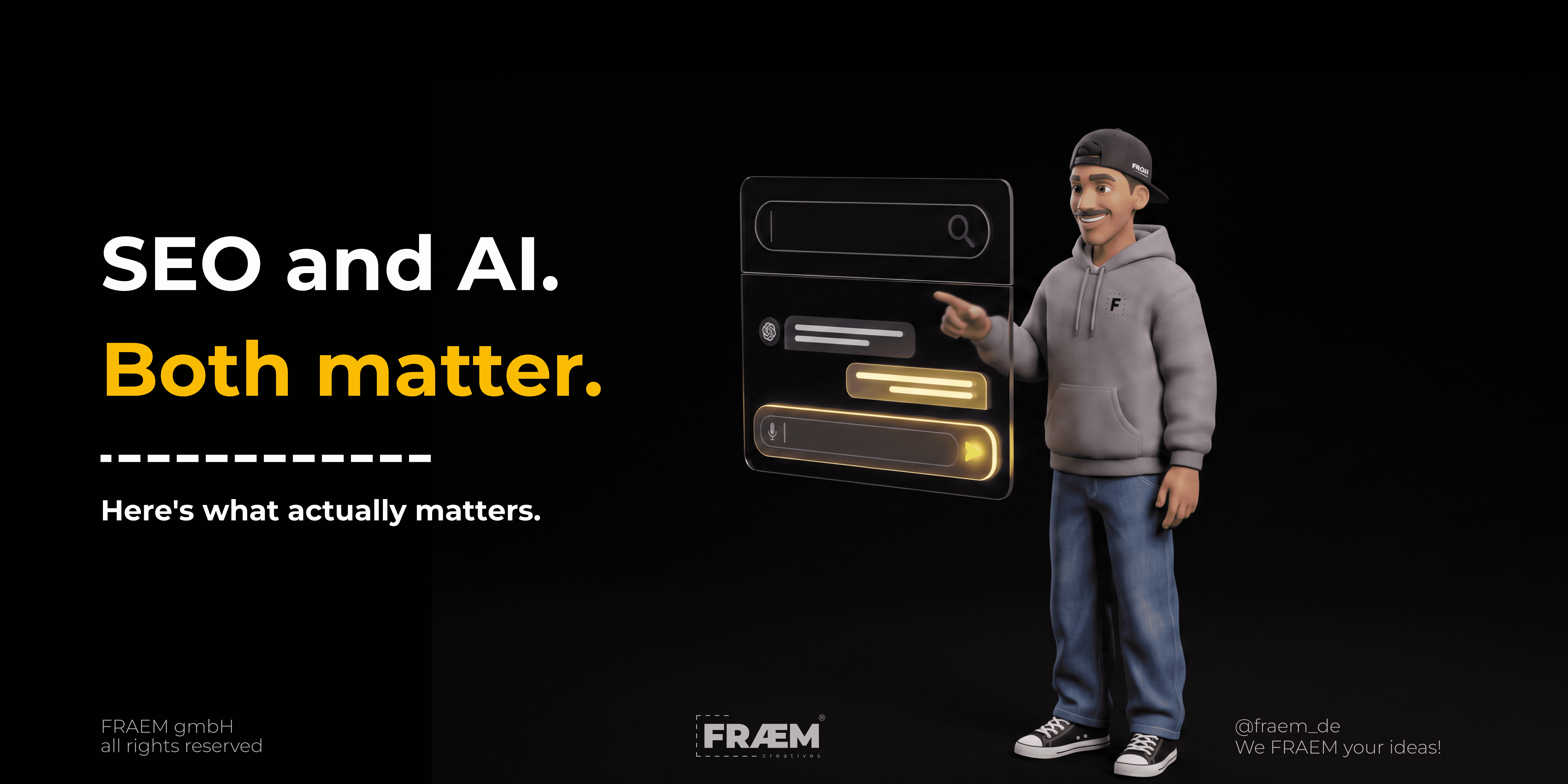
AI Search Is Here. SEO Isn't Dead. Here's What Matters.
43% of Germans use ChatGPT. Search is quietly changing under everyone's feet. Here's what's real, what's hype, and what your business should actually do about it.

Why Your Handwerk Website Isn't Doing Its Job
94% of German Handwerk businesses have a website. Only 3 of 500 audited sites came close to actually doing their job. Here's what "it works for us" is really costing you.

Framer vs. WordPress vs. TYPO3
Framer or WordPress for your Handwerk business? An honest comparison on cost, maintenance, and SEO. Plus when Webflow or TYPO3 actually makes sense.
How Handwerk Businesses Actually Find Azubis: 5 Steps
Finding Azubis and skilled workers in Handwerk: why job ads alone don't work and which five steps actually bring applications.
AI Search Is Here. SEO Isn't Dead. Here's What Matters.
43% of Germans use ChatGPT. Search is quietly changing under everyone's feet. Here's what's real, what's hype, and what your business should actually do about it.
Why Your Handwerk Website Isn't Doing Its Job
94% of German Handwerk businesses have a website. Only 3 of 500 audited sites came close to actually doing their job. Here's what "it works for us" is really costing you.
Framer vs. WordPress vs. TYPO3
Framer or WordPress for your Handwerk business? An honest comparison on cost, maintenance, and SEO. Plus when Webflow or TYPO3 actually makes sense.
Content that converts
(and doesn’t suck).
Let’s talk.
Content that converts
(and doesn’t suck).
Let’s talk.
Content that converts
(and doesn’t suck).
Let’s talk.


Nikkan & Soli Managing Directors
Nikkan & Soli Managing Directors
Nikkan & Soli Managing Directors